fbpx

Branding, logo and webdesign

The company needed a logo for their new business that is recognizable, sleek and creative. What is most important for this new logo is the capacity for it to be used on various mediums and for the different services that they will be offering in the future.

Once the tone and style is set, they will need a website to accompanied the business and its achievements.

Alta Services Int.

Your partner in delivering Business & IT projects and unlocking the most value

Alta Services provides both profit and nonprofit organizations in the Netherlands and Dutch Carribean with out of the box advisory and delivery support to enhance organizations portfolio, program, project management capabilities in order to unlock the most value.

Innovative

Accountable

Collaborative

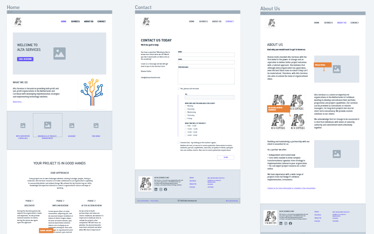
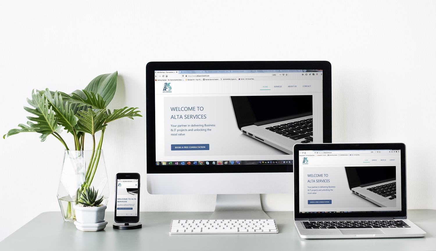
"... via deze groep ben ik contact gekomen met Dean Munsamba en wilde delen dat het een ontzettend prettige samenwerking is geweest. Hij is zeer professioneel en denkt goed mee met hetgeen wat je zou willen bereiken. Uiteindelijk is het meer geworden dan een logo en heb ik naast branding materiaal, ook support gekregen bij mijn website https://www.altaservicesint.com (is nog niet helemaal af). Zie op de afbeeldingen wat sfeermaterialen van mijn logo. Dus voor je logo's, branding, websites etc. is hij aan te raden."

Rianne

1. Design the brand

Before we could even start designing the logo or the website, we spend some time to understand what the company was all about. The history, philosophy, mission and vision and the future projects coming. The following deliverables were created, discussed and tweeked during the preparation phase. – Moodboard – Colours & Voice – Typography Only once the client was fully in on the concept, we sat down to make the logo and a pre-design (the wireframe) for validation. The final designs came as last.

2. The logo design

We went for a mixture of the A & S to refer to the company. The structure embedded in the letters represents the the IT tree or the software systems. This is a concept commonly reffered to in the IT sector and accentuates the growth and prosperity of a company. The 2 mixed colours originally chosen were blue and orange, very often to be found in IT. The Blue itself is a direct reference to the motherland of the founder: Curacao. These were updated later to different shades of Blue to keep it more soft and clean. We ultimately ended up with a main logo and an alternative logo that could be used interchangeably.

3. The website

The process to design and develop the website went very sleek. Once the company’s style guide were defined and the logo validated, we just needed to translate the design document in code and make it come to life. The only issue we ran into is not being able to find all the visuals for the website adequate to the brand. On top of this, a set of icons was customized for the company and set into the brand’s colors to be used online and offline for presentations and documents.