fbpx

Building strong institutions on a one pager website

“The Black African/Belgian/Diaspora/Caribbean stories should have a safe haven to be told, healed, created, documented & lived uncensored.”

This is how the project was introduced.

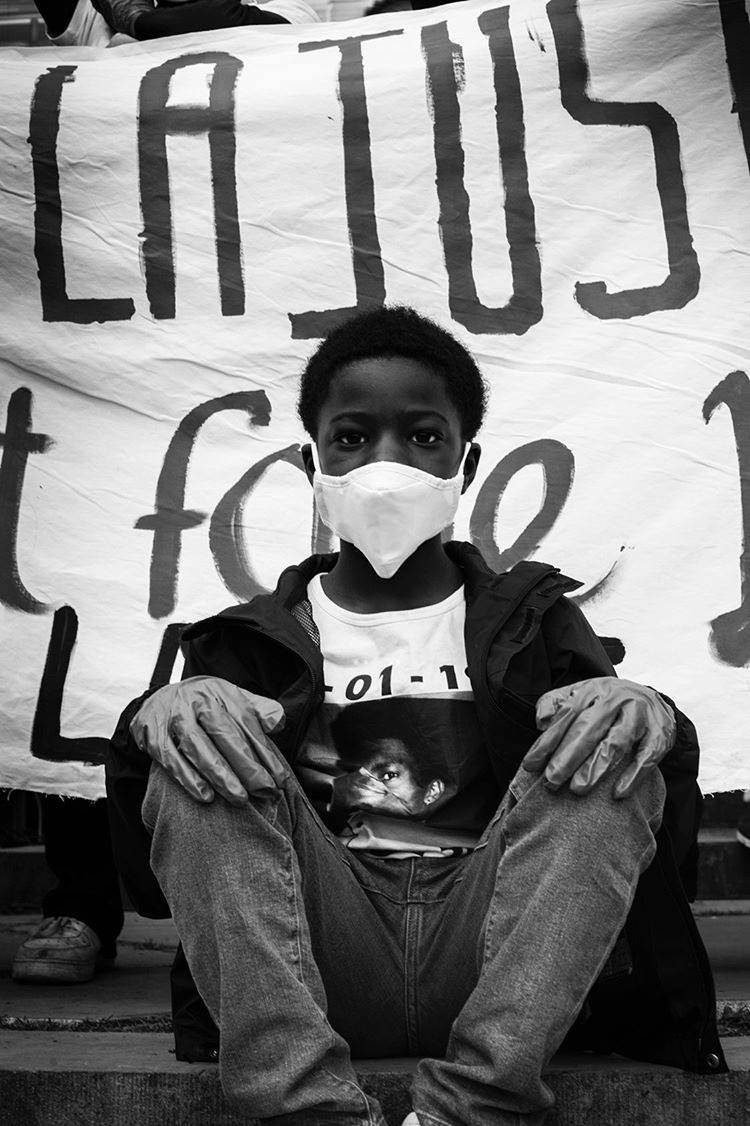
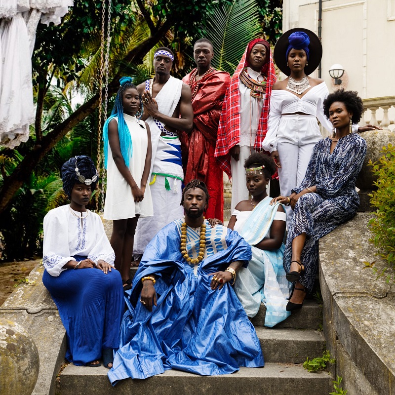
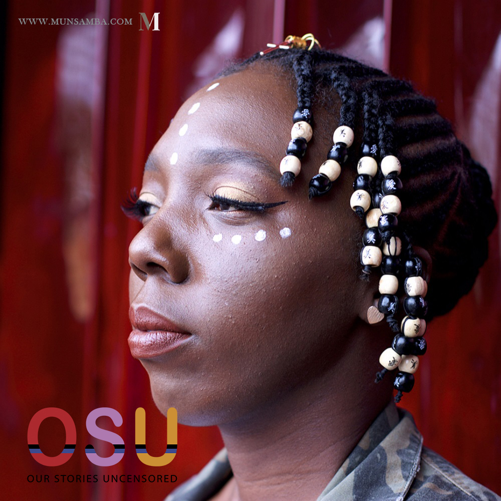
OSU is an organization established by students in Antwerp/Belgium who are devoted to helping the youth to reconnect with their African/Caribbean roots. It is indeed all about storyteling. And that is exactly what is expected from this website project as well.

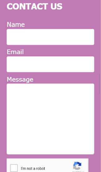
We at Munsamba Digital received the brief of creating an understandable and easy to navigate one pager website for sponsors and partners of OSU.

OSU

Our Stories Uncensored

OSU stands for: Our Stories Uncensored. The name has been used by the organisation since January 2019. By means of our projects and events in the arts, culture & sports sector, our aim is to give youth the opportunity to develop their hard and soft skills. We provide spaces where they can grow under the guidance of role models and professionals who do not necessarily share the same background. These youth will then get the opportunity to launch their own projects and be leaders of projects which they embrace.

Mutilingual

Onepager

UX

1. User Experience

UX or User Experience is “the overall experience of a person using a product such as a website or computer application, especially in terms of how easy or pleasing it is to use.” – Oxford Languages That is also the reason why we at Munsamba Digital have made the design easy to read and simple to navigate. You can therefore argue that the text on the website is too large, but this has been done on purpose for better legibility. So the readers can better focus on the story and messaging behind the organization, rather than on searching frenetically on the website for the info.

2. Social Media Deeplinking

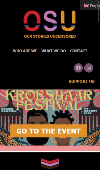
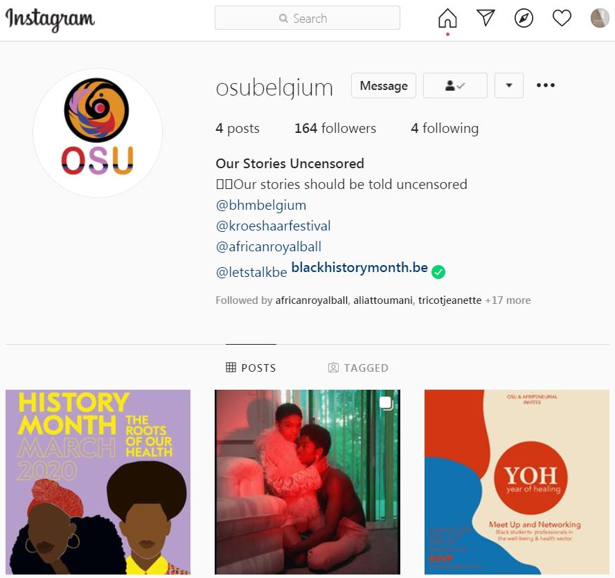
Because OSU is mostly centered around the youth, one of the strategic decision they took was to take all communication to social media. This is how they have been operating these last years and this is not about to change soon. Thus the intended audience for the website is not so much the members of OSU themselves, but sponsors and partners. That is why OSU’s Facebook and Instagram page NEED to be blatantly visible and accessible on the website. Here we can find the social icons both in the header when you enter the website, as in the footer before leaving. The URL’s have been set as “Deep Links” to their respective application. This means that contrary to setting the social media url to open in the internet browser like most website do, we made sure that these links open up in the Facebook-app or in the Instagram-app itself. In this way we get the best experience possible in our interactions with the organization.

3. Multilingual

As if would have otherwise been too easy, there are three national languages present in Belgium: Dutch, French & German. The most used being Dutch and French. We made sure that the OSU website will adapt to anyone visiting the url. So depending on the language you use the most online, here the browser language, the website will load in your language. Adapting to the new world, we deccided to actually have english as the third language instead of German.